Tuesday, 21 September 2010


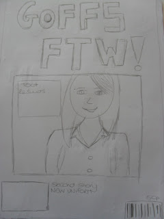
This is my third idea for my contents page. It has the title at the top of the page with the main image just below. There is also space next to the image to breifly introduce the main story and then subheadings below to outline the other parts of the magazine.

This second desgin has the title down the left hand side of the page and the main image at the top of the page. The writing is then in the centre of the page.

This is my first initial idea for my contents page. I have placed the title at the top of the page with the page numbers in the centre. There is also a border around the edge of the page and two pictures of the students in uniform at the bottom of the page.

Monday, 13 September 2010

Sunday, 12 September 2010


This Idea is based on the new school uniform and what the girls think of it changing to longer skirts and blazers. The main image will be of three girls in the new uniform in the center/bottom of the page with the title of the story above them. The title of the magazine is positioned down the side to give more room for the main image.
This is my other idea for my school magazine. The Title of the magazine is at the top of the page and the picture is a medium close up in the center of the page. This will attract the audience's eye as the image is of a big size.

Draft of Front Page of Magazine


This is the first draft for my Goffs school magazine. I have decided to call it Goffs FTW (for the win) as it is a current saying between my target audience as teenagers. Also it has a play on words as Goffs beat Broxbourne school with the GSCE results this year. That is why the title of the main story is Goffs V Broxbourne as the main story is about the GCSE results. I decided to have My title of the magazine going diagonaly across the page as it is different to most magazines.